Finance App Rebranding
Led a comprehensive brand renewal across digital touchpoints to unify our expanding fintech product suite and strengthen market presence.
Finance App Rebranding
Led a comprehensive brand renewal across digital touchpoints to unify our expanding fintech product suite and strengthen market presence.
Finance App Rebranding
Led a comprehensive brand renewal across digital touchpoints to unify our expanding fintech product suite and strengthen market presence.
Date
Sep 2024
Role
Art Direction, Lead Designer
Category
Web Design
Company
iBank Marketing
Overview
I led the complete brand renewal of our personal finance app across web, marketing, and communication channels as the product expanded into transfers, insurance, and savings services. The brand had become fragmented over time, and with our design lead on medical leave, I became the sole designer with brand knowledge, executing the renewal whilst guiding other designers through the transformation.
I redesigned the entire website, established a unified illustration system aligned with the refreshed app, and created comprehensive marketing assets including EDM templates, App Store screenshots, and motion graphics. Working under tight timelines and coordinating across teams, I delivered visual direction and design systems that brought consistency across all channels.
The renewal achieved a cohesive brand identity, clearer product storytelling, and measurably better marketing performance with positive internal feedback. By creating scalable systems rather than one-off designs, I ensured the brand could evolve with our expanding offerings.
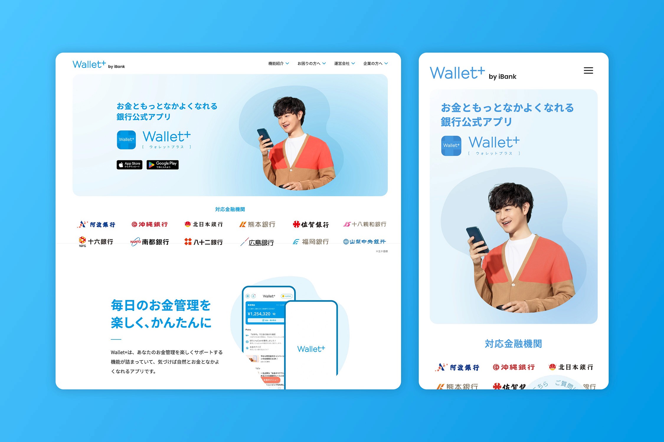
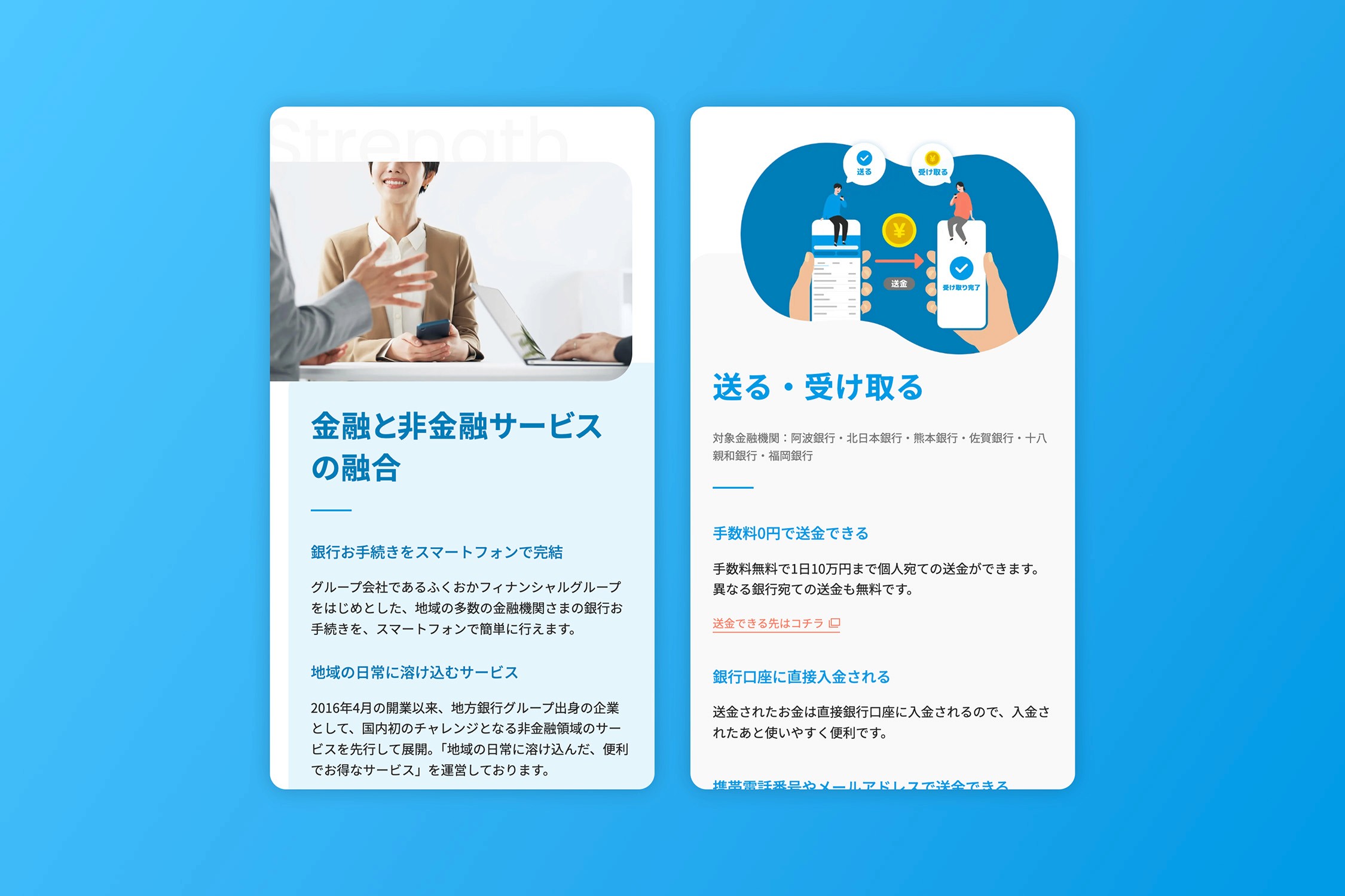
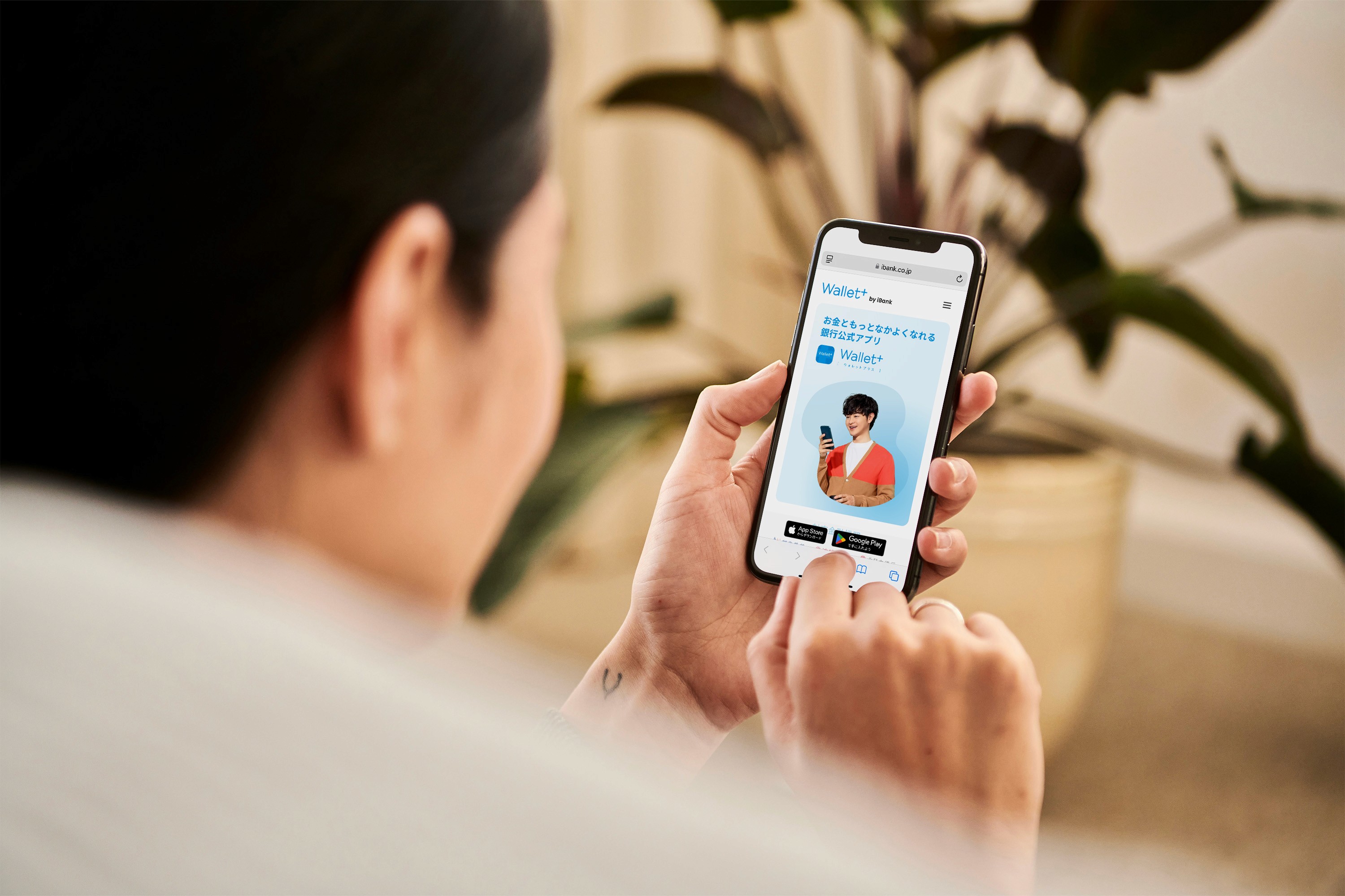
Responsive Design & Dual Audience Strategy
The responsive layout maintains visual consistency across devices, optimising content hierarchy for different screen sizes. Consumer-facing pages leverage warm colours and approachable illustrations to build trust, whilst B2B pages adopt clean typography and professional layouts to convey credibility. This demonstrates how a cohesive brand can serve multiple audiences without fragmenting identity.
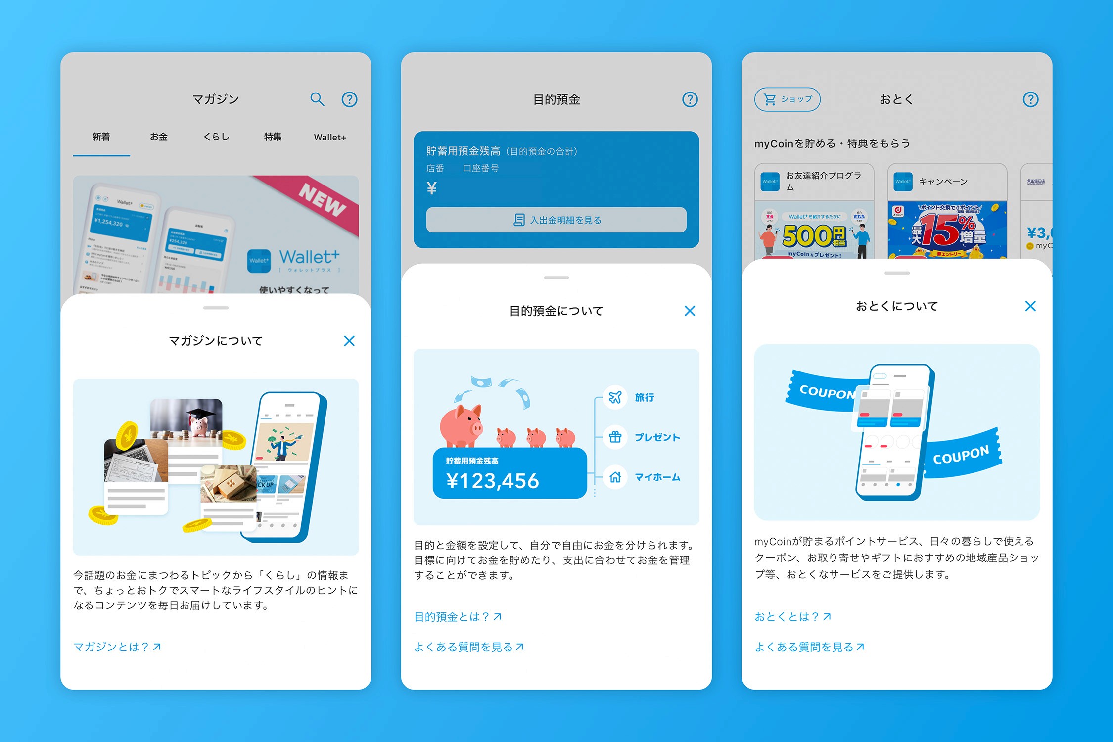
Unified Visual System Across Touchpoints
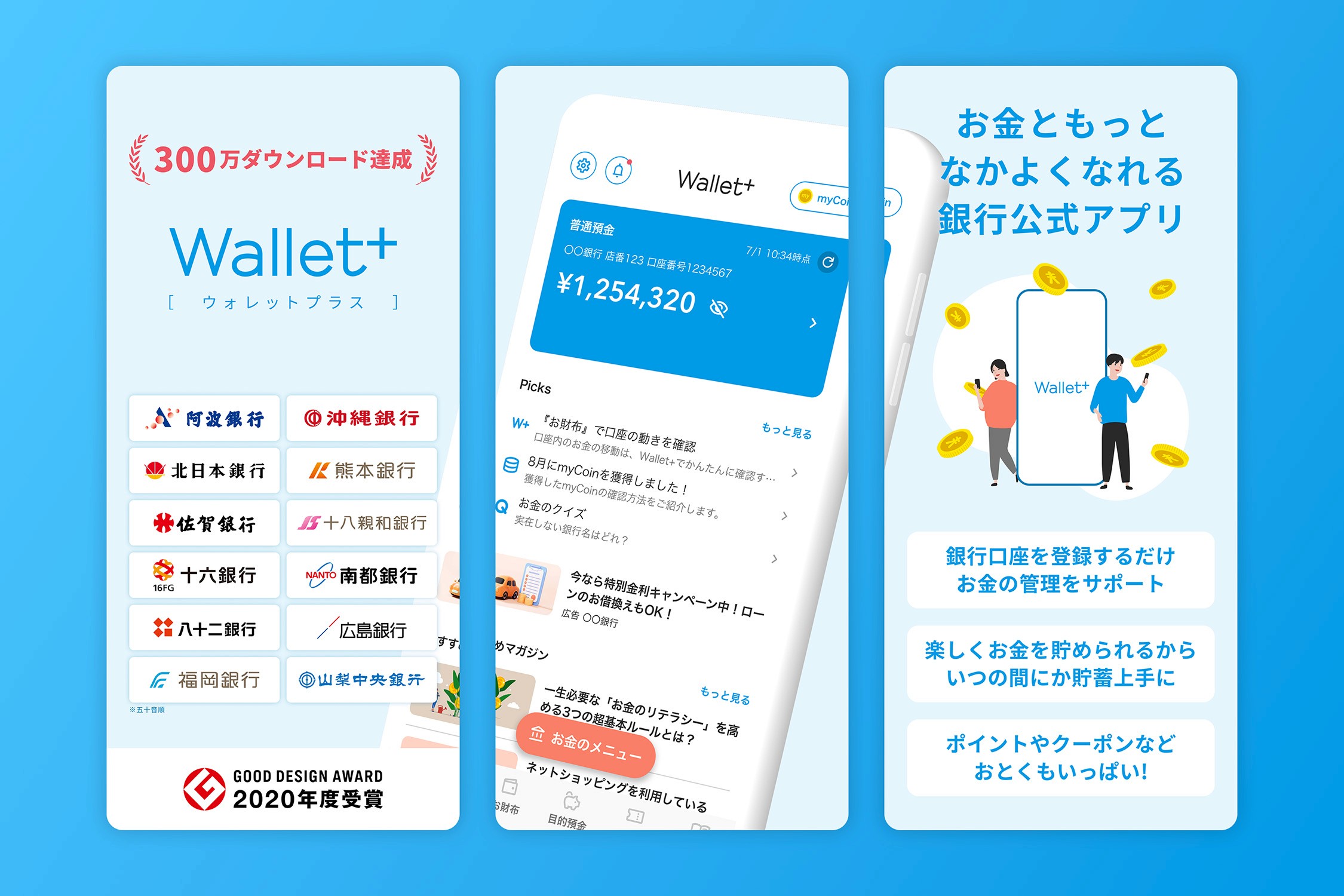
In-app illustrations reduce cognitive load for financial concepts through consistent character designs and colour treatments. This visual language extends seamlessly into App Store screenshots, balancing feature communication with brand storytelling through strategic colour blocking and clear information hierarchy, positioning the app as both capable and approachable.
Finance App Rebranding
Led a comprehensive brand renewal across digital touchpoints to unify our expanding fintech product suite and strengthen market presence.
Finance App Rebranding
Led a comprehensive brand renewal across digital touchpoints to unify our expanding fintech product suite and strengthen market presence.
Finance App Rebranding
Led a comprehensive brand renewal across digital touchpoints to unify our expanding fintech product suite and strengthen market presence.
Date
Sep 2024
Role
Art Direction, Lead Designer
Category
Web Design
Company
iBank Marketing
Overview
I led the complete brand renewal of our personal finance app across web, marketing, and communication channels as the product expanded into transfers, insurance, and savings services. The brand had become fragmented over time, and with our design lead on medical leave, I became the sole designer with brand knowledge, executing the renewal whilst guiding other designers through the transformation.
I redesigned the entire website, established a unified illustration system aligned with the refreshed app, and created comprehensive marketing assets including EDM templates, App Store screenshots, and motion graphics. Working under tight timelines and coordinating across teams, I delivered visual direction and design systems that brought consistency across all channels.
The renewal achieved a cohesive brand identity, clearer product storytelling, and measurably better marketing performance with positive internal feedback. By creating scalable systems rather than one-off designs, I ensured the brand could evolve with our expanding offerings.
Responsive Design & Dual Audience Strategy
The responsive layout maintains visual consistency across devices, optimising content hierarchy for different screen sizes. Consumer-facing pages leverage warm colours and approachable illustrations to build trust, whilst B2B pages adopt clean typography and professional layouts to convey credibility. This demonstrates how a cohesive brand can serve multiple audiences without fragmenting identity.
Unified Visual System Across Touchpoints
In-app illustrations reduce cognitive load for financial concepts through consistent character designs and colour treatments. This visual language extends seamlessly into App Store screenshots, balancing feature communication with brand storytelling through strategic colour blocking and clear information hierarchy, positioning the app as both capable and approachable.